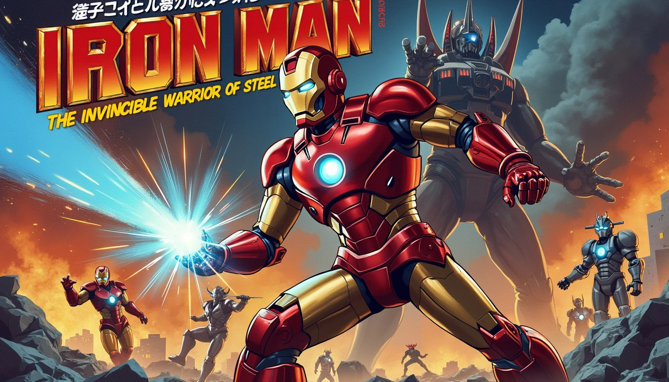
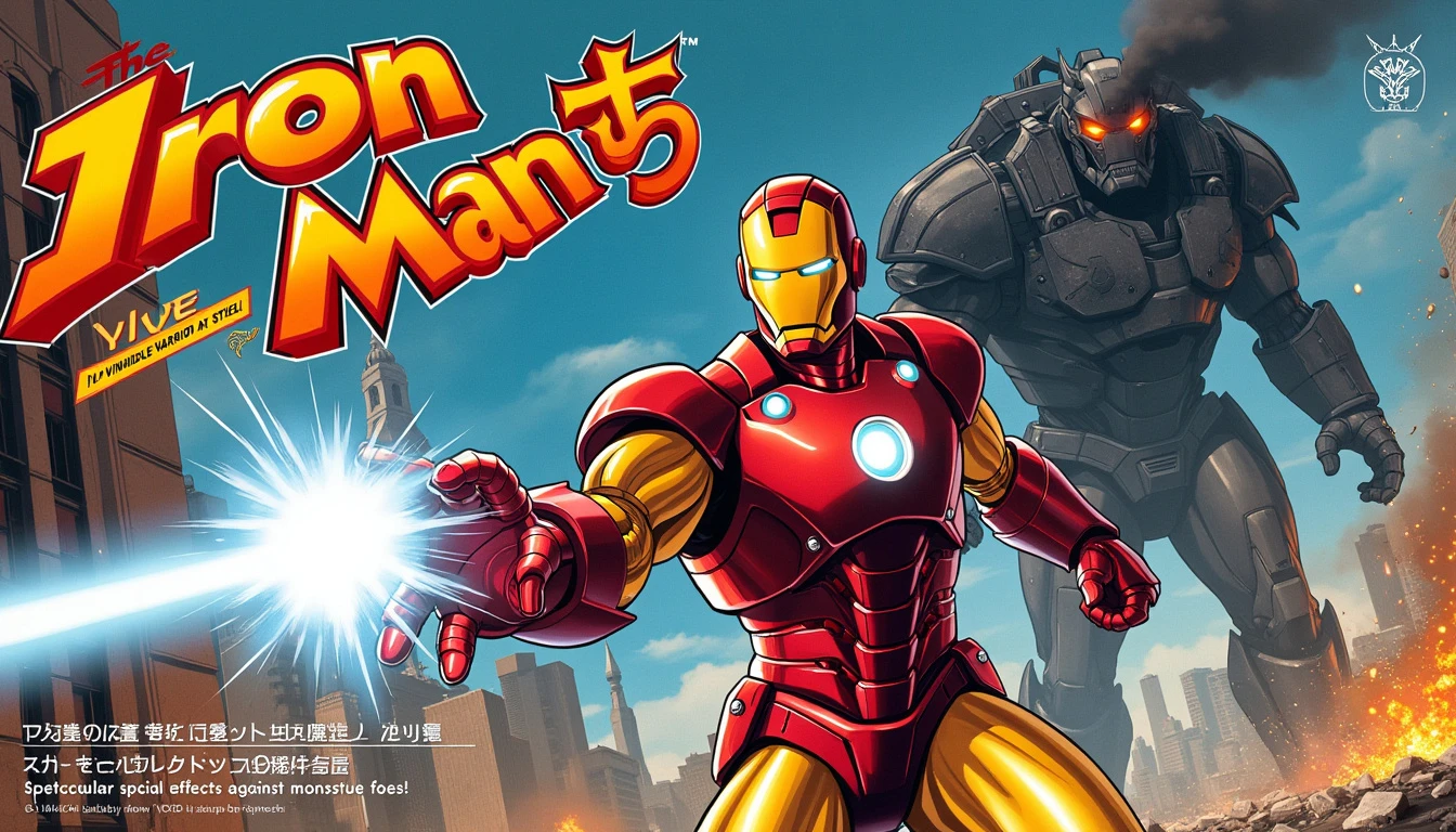
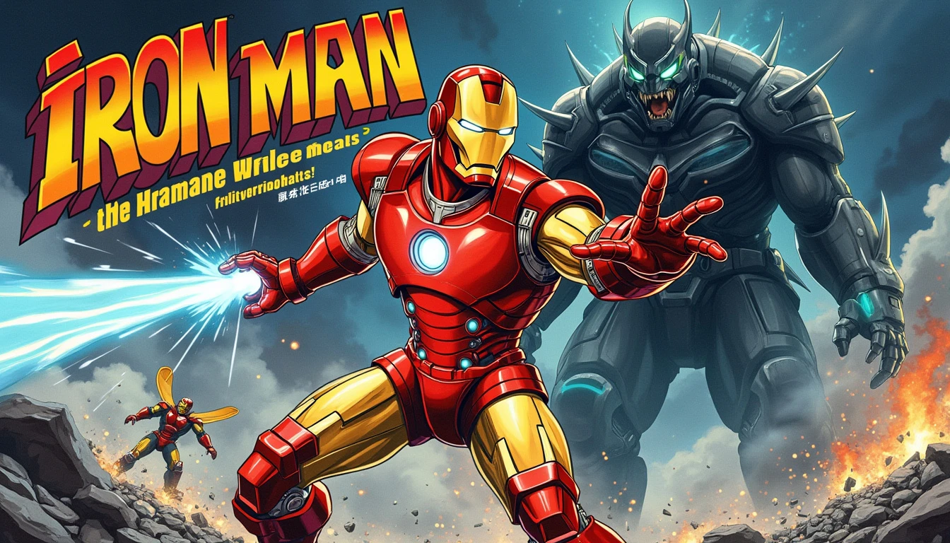
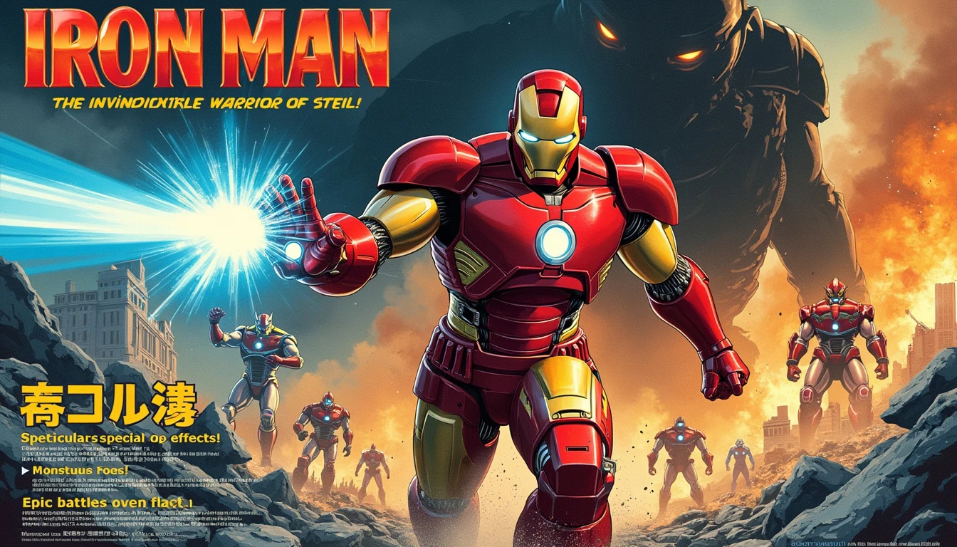
The magazine promotional poster for Iron Man as a 1980s Japanese tokusatsu show would have a bold, vibrant aesthetic. The central image would depict Iron Man in his exaggerated, chrome- plated armor, mid- action pose, with one arm extended, firing a bright, blue energy beam. His eyes would glow intensely, adding to the dramatic effect. Behind him, the background would feature a cityscape in ruins, with smoke billowing and sparks flying, creating a sense of urgency and battle. A large, menacing kaiju or mechanical villain would loom in the background, partially shadowed, with only its glowing eyes and sharp, angular outlines visible, hinting at the upcoming showdown. The poster would use bold, metallic fonts for the title, with the words "Iron Man" written in both English and stylized Japanese katakana characters. The show's title would be displayed prominently at the top, while the tagline, written in a bright yellow color, would be placed below: "The Invincible Warrior of Steel!" To the side, smaller images of supporting characters or other suits of armor would be showcased, along with text boxes highlighting key features like "Spectacular Special Effects!" and "Epic Battles Against Monstrous Foes!" The overall color palette would mix deep reds, golds, and blues, with the addition of flashy, electric tones to capture the dynamic and thrilling essence of a tokusatsu series from the 1980s