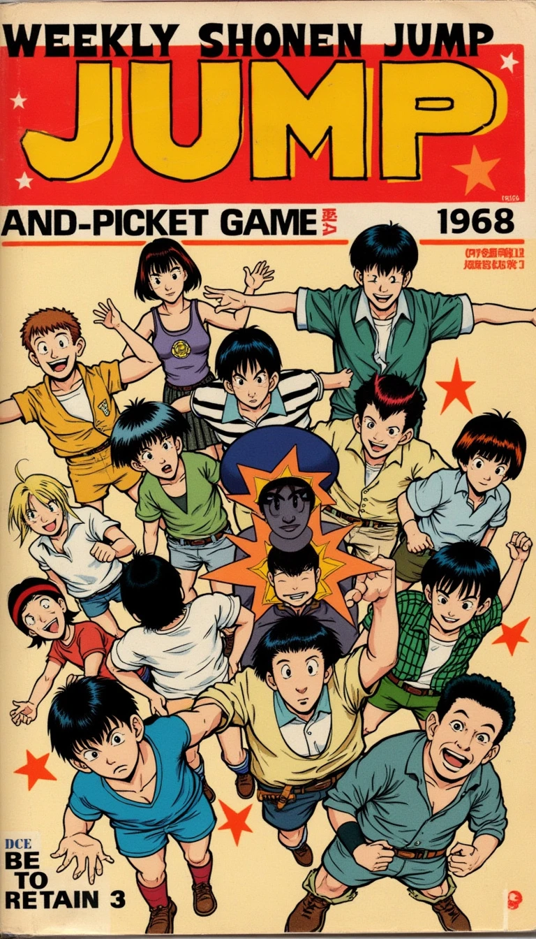
The cover of the first issue of Weekly Shonen Jump, released in 1968, has a vintage, retro design that reflects the era. The layout is bold yet simple, with the magazine's name written in large, blocky kanji at the top, featuring a red and yellow color scheme. The typography is stylized to capture attention, with a classic, hand- drawn look. The main image on the cover features a mix of different characters from popular manga of the time, with each one drawn in a traditional 1960s anime art style. The characters are energetic and expressive, with thick outlines and solid colors, positioned dynamically to create a sense of action and excitement. The illustrations are somewhat rough and unpolished, reflecting the early stages of the magazine’s history. The background is mostly plain, with a few minimal design elements like stars or action lines to enhance the characters' energy. The overall color palette leans towards bright, primary colors like red, yellow, and blue, creating a vibrant and eye- catching visual. Despite its simplicity, the cover conveys the boldness and excitement that would define Weekly Shonen Jump in the years to come