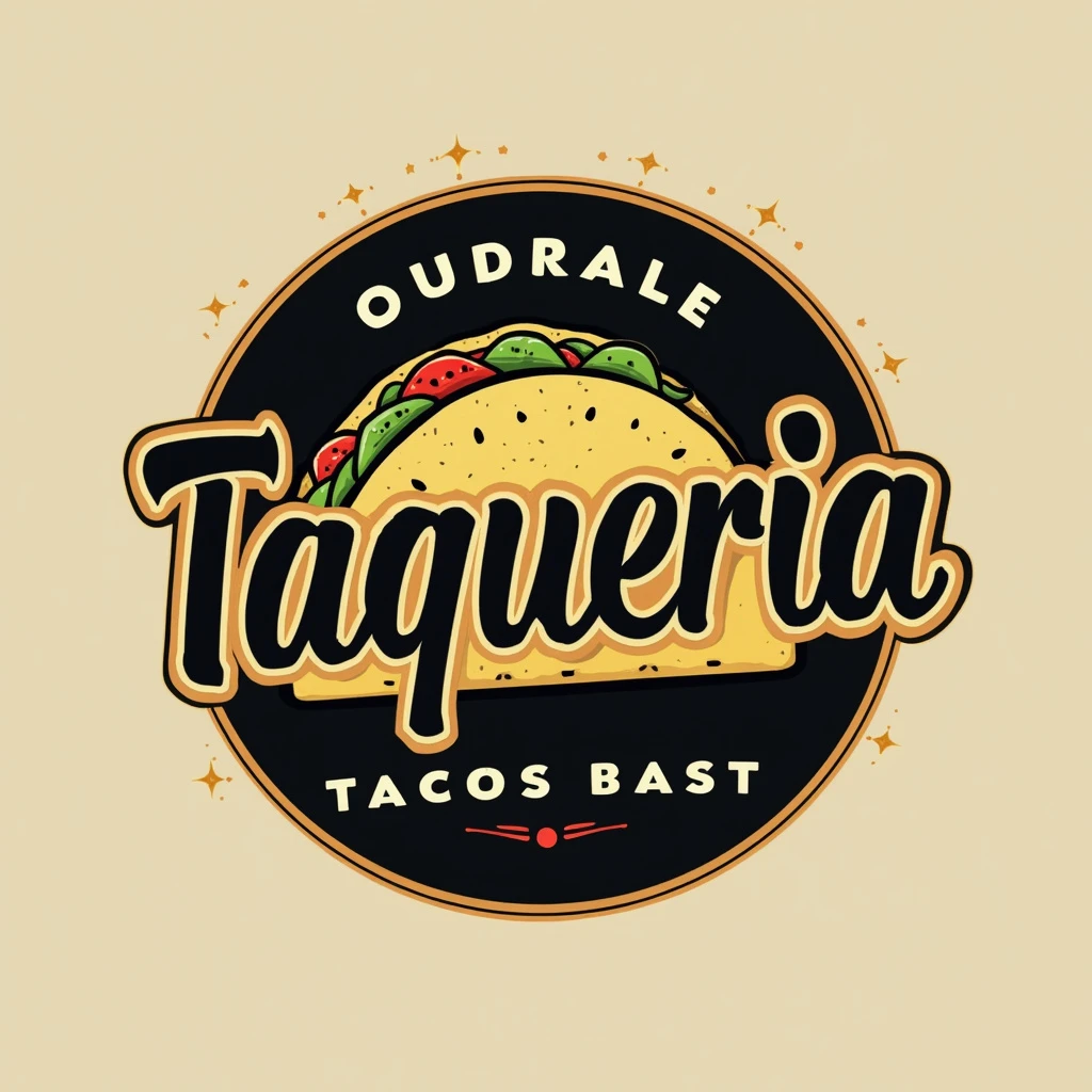
To enhance the logo concept for "Taqueria" while keeping the background empty, here’s an improved version:- **Font**: Choose a custom, modern serif font with subtle flourishes or a geometric sans- serif font that offers both elegance and simplicity. The typography should have a slight Mexican cultural touch, without being too ornate. **Color Palette**: Stick to a refined monochrome palette, using black and gold or black and white for a timeless and classy appeal. This will elevate the elegance while maintaining a modern look. You can incorporate small pops of color, like a minimal red or green accent in the icon, to subtly hint at Mexican flavors without overwhelming the design. **Icon**: Instead of an outlined taco, use a sleek, abstract taco shape or a minimalist representation of traditional Mexican elements like an agave plant, sombrero, or stylized taco shell. The icon should be smoothly integrated within or beside the typography, allowing it to be versatile for various placements. **Shape**: Make the logo horizontal with the text and icon aligned in a balanced, proportional layout. This will create a clean, minimal look that stands out without a cluttered background. By keeping the background empty, this will allow the logo to be used on various surfaces (like menus, signage, and packaging) and ensure the focus remains on the sleek design
