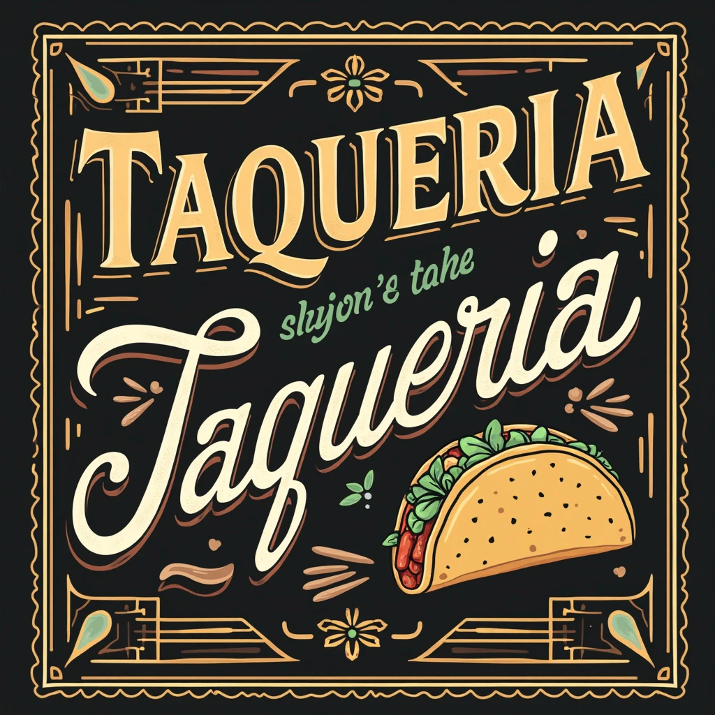
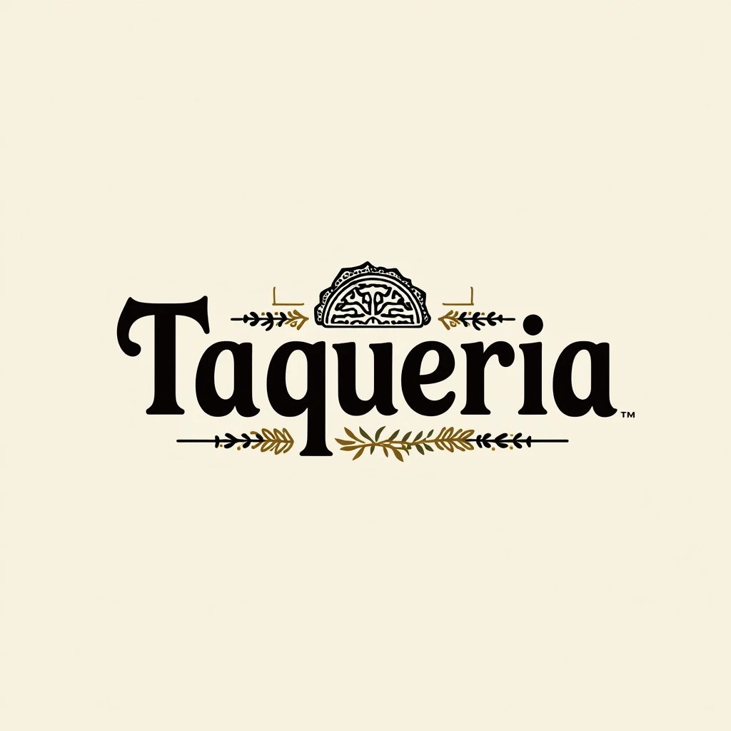
To enhance the "Taqueria" logo with subtle Mexican influences while keeping it **elegant, modern, catchy, and tasteful**, here’s a refined approach:- **Font**: Select a sleek, contemporary serif or geometric sans- serif font with minimal Mexican- inspired elements, such as slight curves or flourishes in the letters, to give it cultural character without overdoing it. The design should remain clean and modern to ensure sophistication. **Color Palette**: Use a timeless black and gold or black and white palette for the base, ensuring elegance. To introduce a hint of Mexican influence, integrate tasteful accents of vibrant colors like muted reds, greens, or oranges—found in traditional Mexican art—into the design, but in small, strategic touches to maintain a modern, balanced look. **Icon**: Instead of a typical taco illustration, consider incorporating abstract, modern representations of traditional Mexican patterns or motifs (such as a subtle Aztec or Talavera- inspired line art) around or within the typography. You can also include a stylized taco with clean lines, keeping it minimal but delicious- looking, adding just enough detail to make it appetizing without losing the elegance. **Layout**: Keep the layout horizontal with the text and icon aligned for a clean, proportional look. Incorporating the subtle Mexican elements into or around the word "Taqueria" will make it visually striking yet refined. This approach blends modern design with just enough Mexican influence to make the logo culturally relevant while maintaining its elegance and tasteful appeal, perfect for a contemporary dining experience